AIGA 365 Winner for Advertising Design!
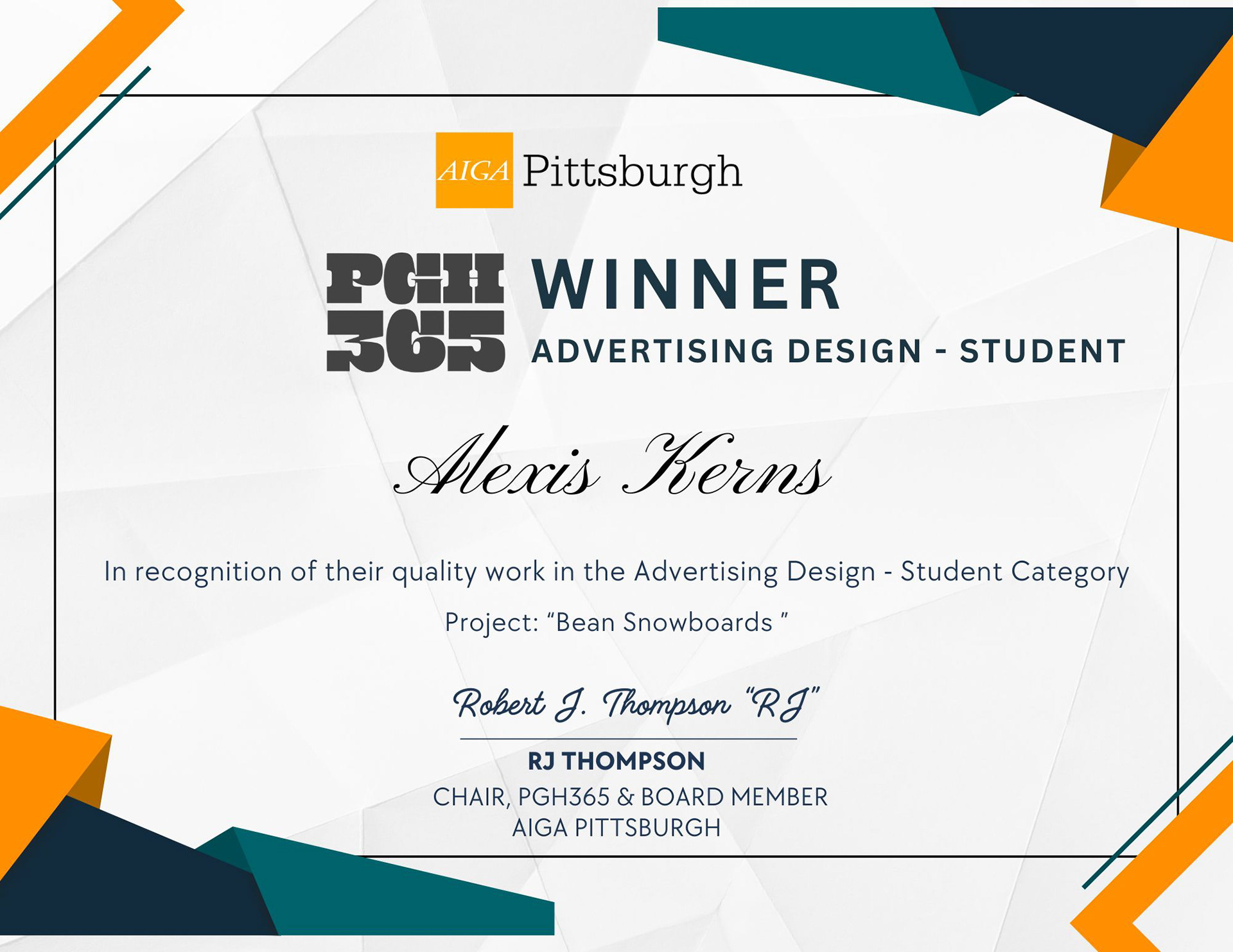
Bean Snowboards
Branding & Product Design for a Y2K-Inspired Snowboard Collection
Overview:
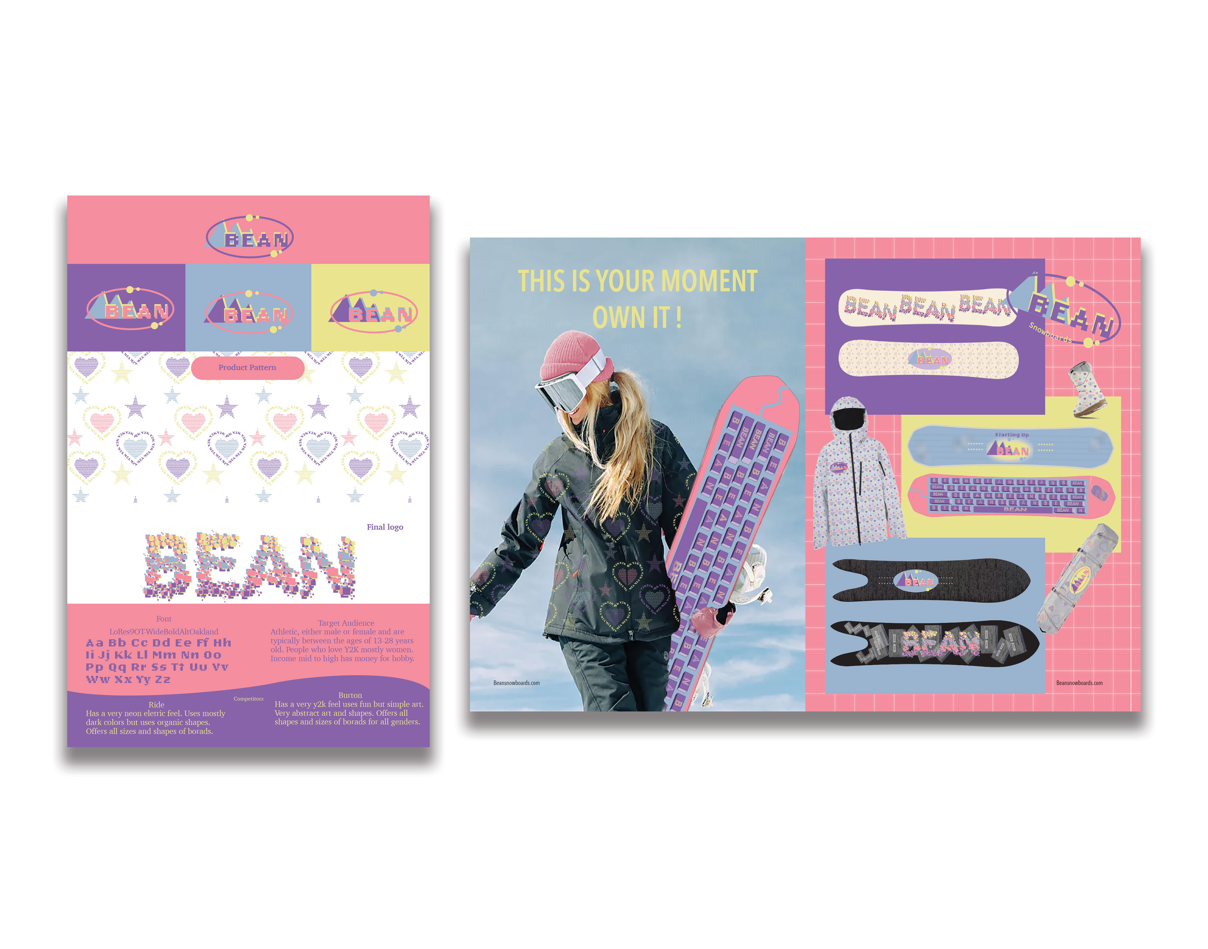
Bean Snowboards is a proudly all-women-owned company that celebrates inclusivity and individuality in the snowboarding community. Designed for both beginners and seasoned riders, this branding project was created with a focus on women in their 20s and 30s. The aesthetic leans into a softer, nostalgic feel, with a design language rooted in pastel tones and early 2000s (Y2K) style.
Bean Snowboards is a proudly all-women-owned company that celebrates inclusivity and individuality in the snowboarding community. Designed for both beginners and seasoned riders, this branding project was created with a focus on women in their 20s and 30s. The aesthetic leans into a softer, nostalgic feel, with a design language rooted in pastel tones and early 2000s (Y2K) style.
Concept & Visual Direction:
The core theme of this project is inspired by Y2K culture—a vibrant era defined by bold shapes, chunky typography, digital graphics, and playful color palettes. The design captures the tech-optimism of the early 2000s, referencing the rise of home computers, neon fashion, and pixel-based art.
The core theme of this project is inspired by Y2K culture—a vibrant era defined by bold shapes, chunky typography, digital graphics, and playful color palettes. The design captures the tech-optimism of the early 2000s, referencing the rise of home computers, neon fashion, and pixel-based art.
Logo Design:
Two logos were developed for the campaign:
Two logos were developed for the campaign:
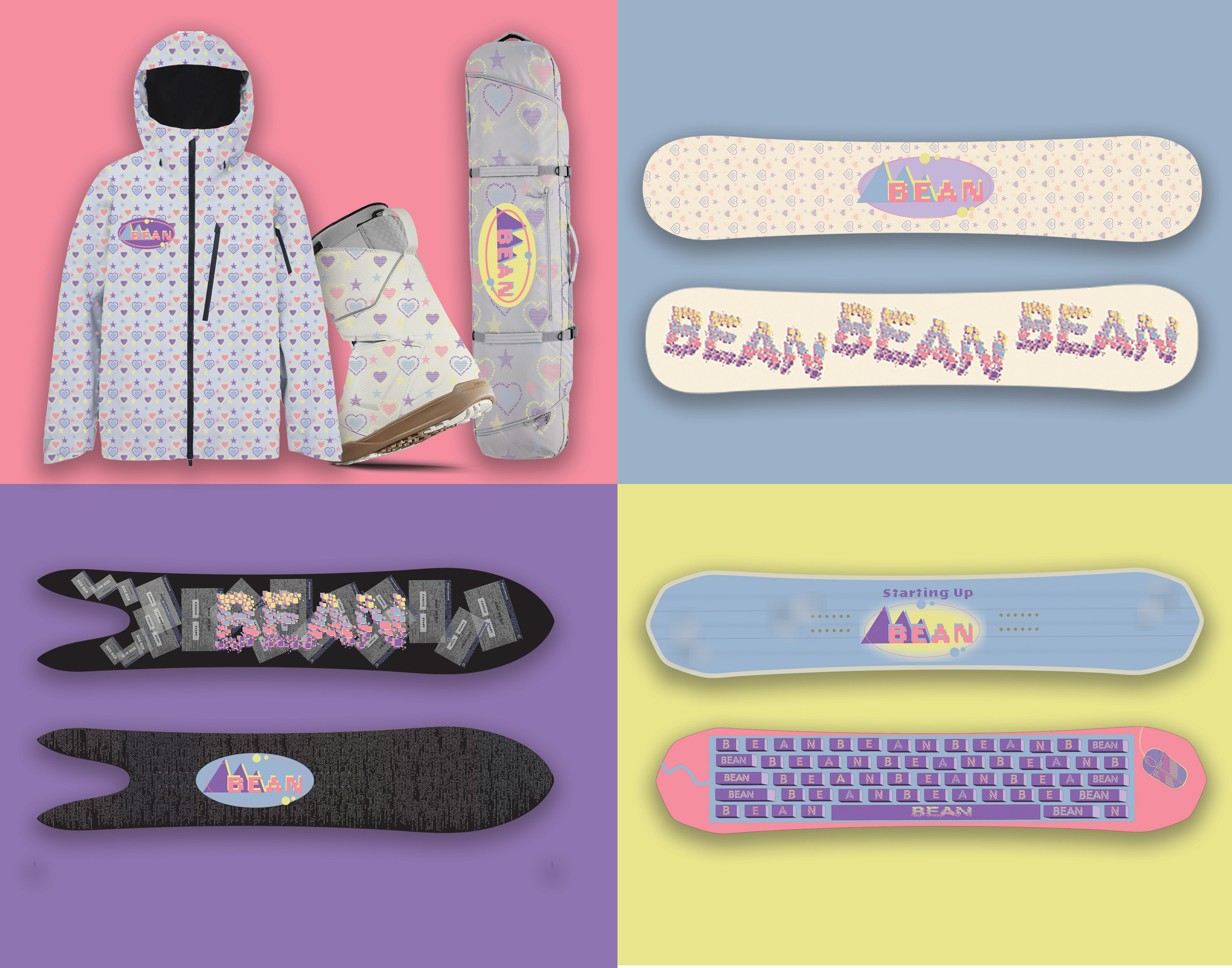
The primary logo draws from Y2K-era brand marks, featuring bold typography and fluid shapes. Its color palette—blues, yellows, purples, and pinks—evokes the pastel-neon spectrum of the time. The logo is designed to be adaptable, allowing the colors to shift throughout the branding materials. The secondary, graphic logo takes a more pixelated approach, spelling out “Bean” in colorful square blocks—an homage to retro digital aesthetics and a direct nod to the snowboarding community’s love of bold, expressive design.
Snowboard Graphics:
The board designs push the tech-inspired concept even further:
The board designs push the tech-inspired concept even further:
One board features coding script as a background texture. Another resembles a computer keyboard and mouse, integrating tactile nostalgia into the graphic layout. The final board design is adorned with pixelated hearts, tying emotion to retro technology.
Print & Campaign Design:
The accompanying magazine spread maintains a strong Y2K visual style, incorporating neon hues, chunky text, and bold, high-impact headlines. Every element was carefully curated to resonate with the target demographic while reinforcing the brand’s message of inclusivity and fun.
The accompanying magazine spread maintains a strong Y2K visual style, incorporating neon hues, chunky text, and bold, high-impact headlines. Every element was carefully curated to resonate with the target demographic while reinforcing the brand’s message of inclusivity and fun.
Result:
This campaign for Bean Snowboards captures the spirit of a generation raised on early internet culture, while supporting a diverse and welcoming space in the world of snowboarding.
This campaign for Bean Snowboards captures the spirit of a generation raised on early internet culture, while supporting a diverse and welcoming space in the world of snowboarding.