Book Cover & Inside Pages Redesign
Conceptual Print Design Project
Overview:
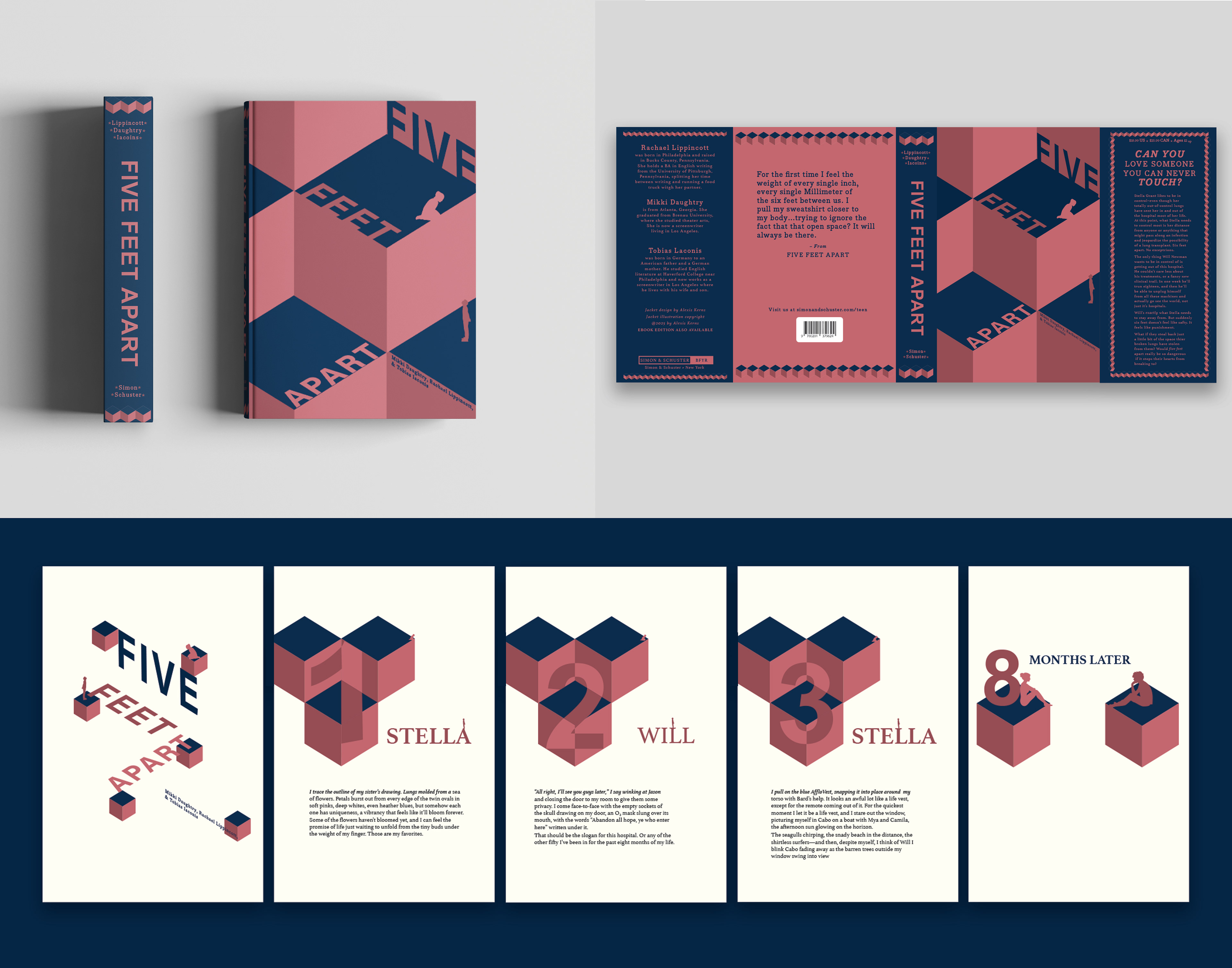
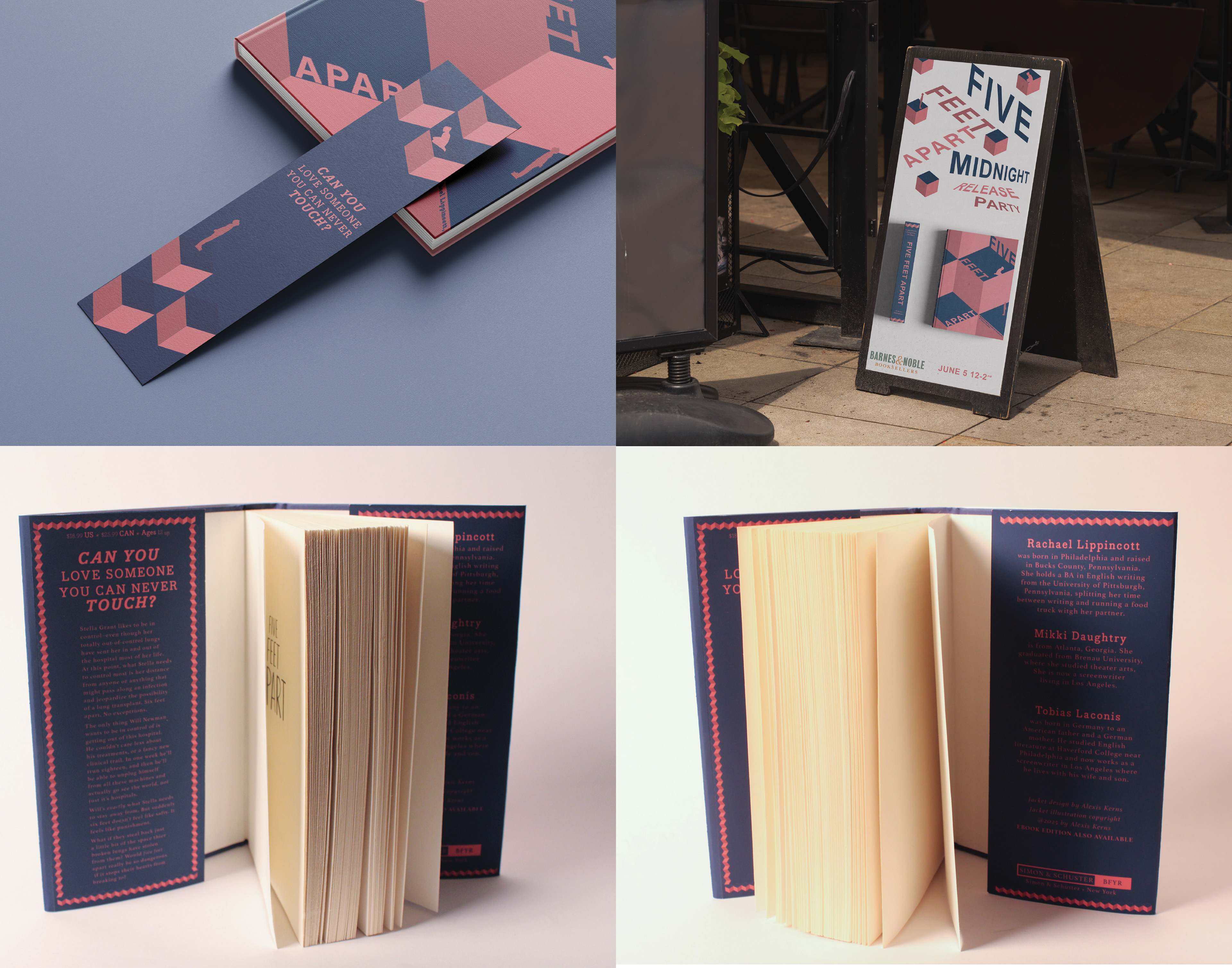
This redesign project focused on visually representing the emotional and physical journey of the main characters in the story—two individuals who begin worlds apart and grow emotionally closer over time. Despite their deepening connection, a shared illness prevents them from ever truly being near one another. This tension between closeness and distance became the core concept for the design.
This redesign project focused on visually representing the emotional and physical journey of the main characters in the story—two individuals who begin worlds apart and grow emotionally closer over time. Despite their deepening connection, a shared illness prevents them from ever truly being near one another. This tension between closeness and distance became the core concept for the design.
Concept & Execution:
To express this narrative visually, I employed an optical illusion technique to create a sense of space and depth on a flat surface, subtly reinforcing the idea of closeness that remains just out of reach. This illusion adds a layer of visual tension, mirroring the emotional complexity of the characters’ relationship.
To express this narrative visually, I employed an optical illusion technique to create a sense of space and depth on a flat surface, subtly reinforcing the idea of closeness that remains just out of reach. This illusion adds a layer of visual tension, mirroring the emotional complexity of the characters’ relationship.
Design Choices:
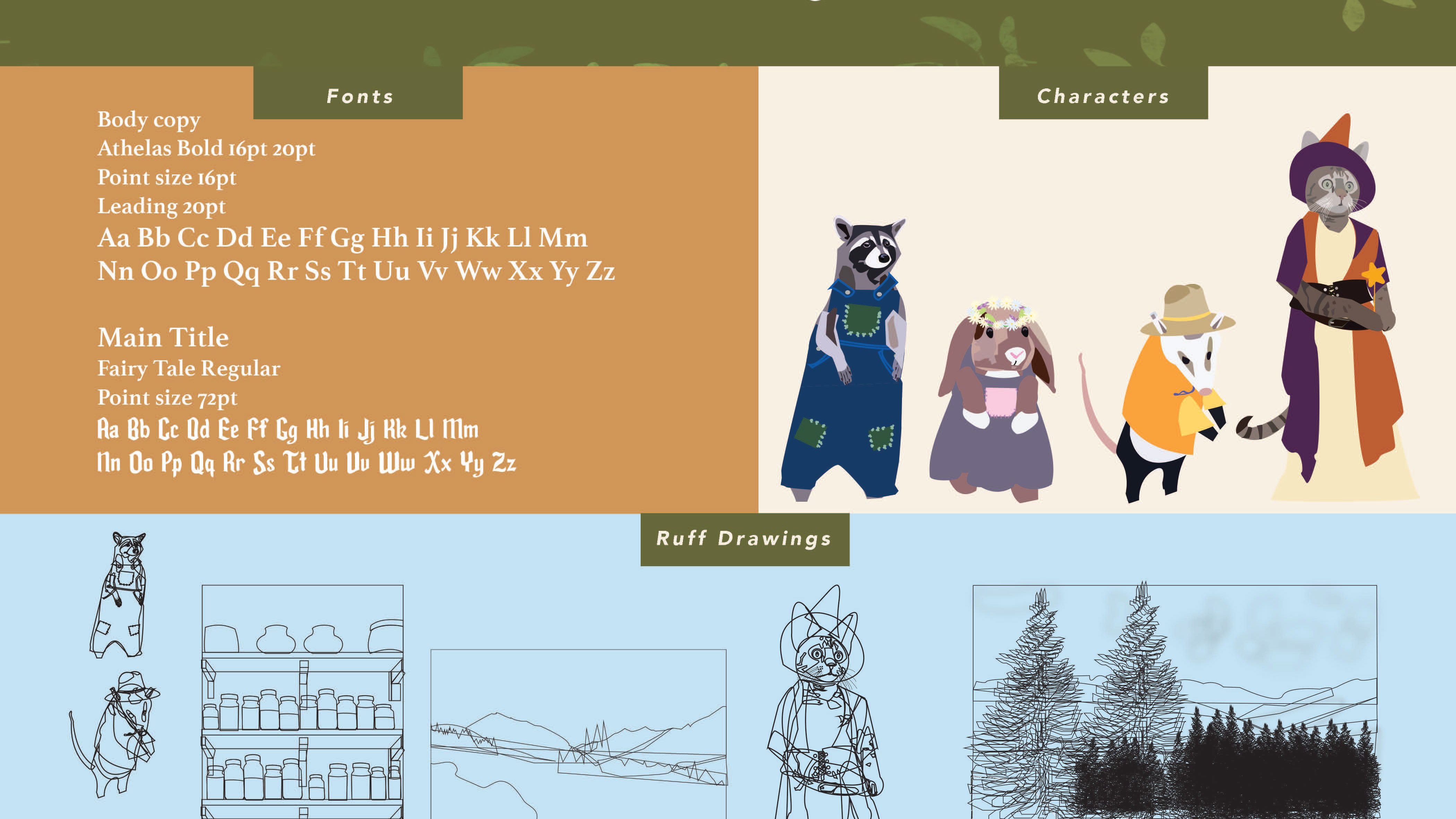
The color palette and typography were inspired by the original design, maintaining a sense of continuity while deepening its meaning. The colors reflect key aspects of each character’s personality—soft yet vibrant tones that speak to their emotional world. The handwritten, rough-edged font adds a personal, almost intimate touch, reinforcing the raw and vulnerable nature of the story.
The color palette and typography were inspired by the original design, maintaining a sense of continuity while deepening its meaning. The colors reflect key aspects of each character’s personality—soft yet vibrant tones that speak to their emotional world. The handwritten, rough-edged font adds a personal, almost intimate touch, reinforcing the raw and vulnerable nature of the story.
Result:
The redesigned cover and inside pages aim to enhance the reader’s emotional connection to the story, using visual storytelling to echo the narrative’s central themes of connection, distance, and longing.
The redesigned cover and inside pages aim to enhance the reader’s emotional connection to the story, using visual storytelling to echo the narrative’s central themes of connection, distance, and longing.