
Hex and Feathers
Branding & Identity for a Vintage Lifestyle Shop
Overview:
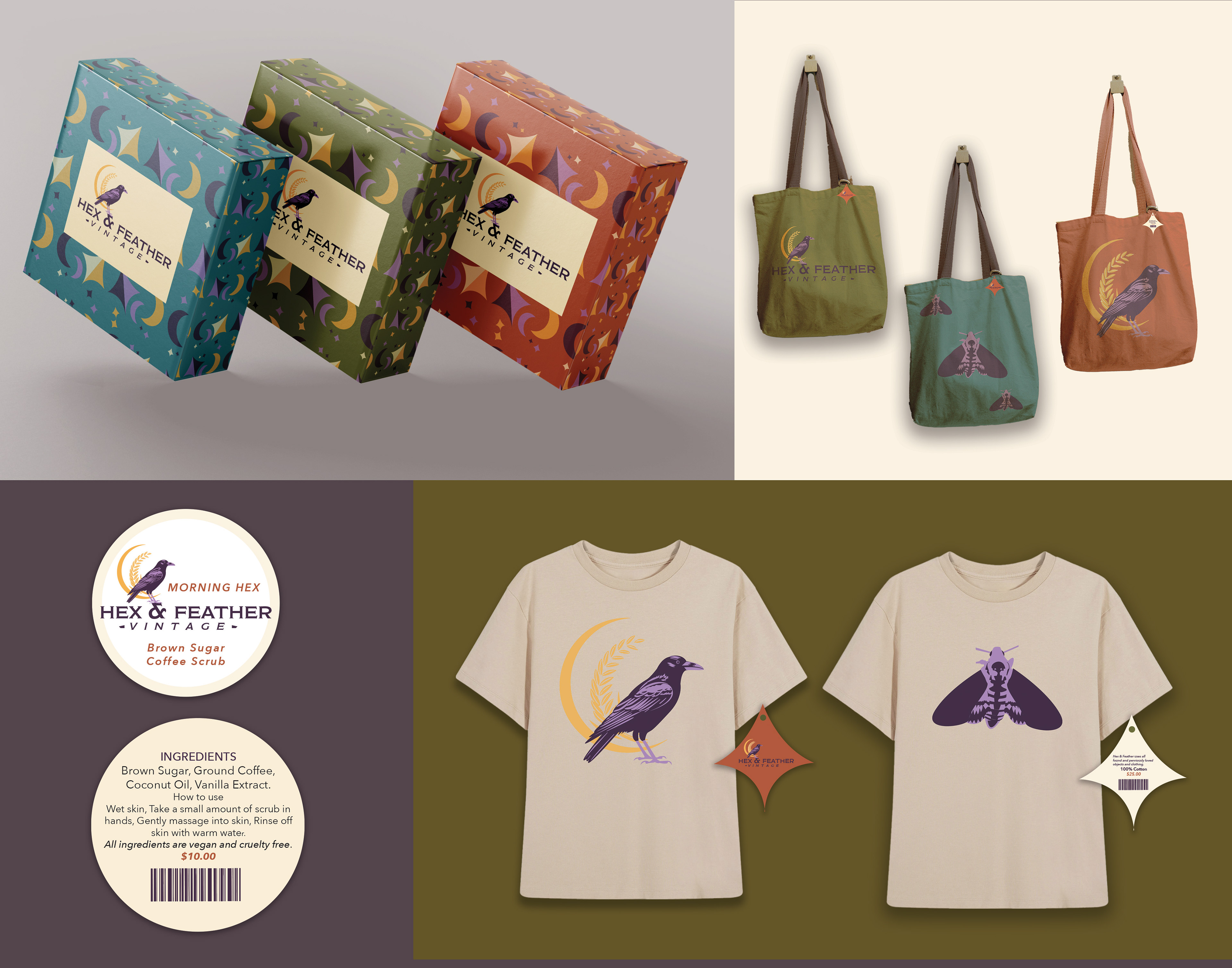
Hex and Feathers is a small business I co-founded with my mother, born out of a shared love for vintage treasures and the magic of reimagining the old into something new. Our shop features a wide range of unique, curated items—from soaps and scrubs to shirts, bags, flowerpots, terrariums, and many other thoughtfully repurposed objects. Each piece in the shop carries a story, having been “previously loved” and given new life through creative transformation.
Hex and Feathers is a small business I co-founded with my mother, born out of a shared love for vintage treasures and the magic of reimagining the old into something new. Our shop features a wide range of unique, curated items—from soaps and scrubs to shirts, bags, flowerpots, terrariums, and many other thoughtfully repurposed objects. Each piece in the shop carries a story, having been “previously loved” and given new life through creative transformation.
Brand Concept & Identity:
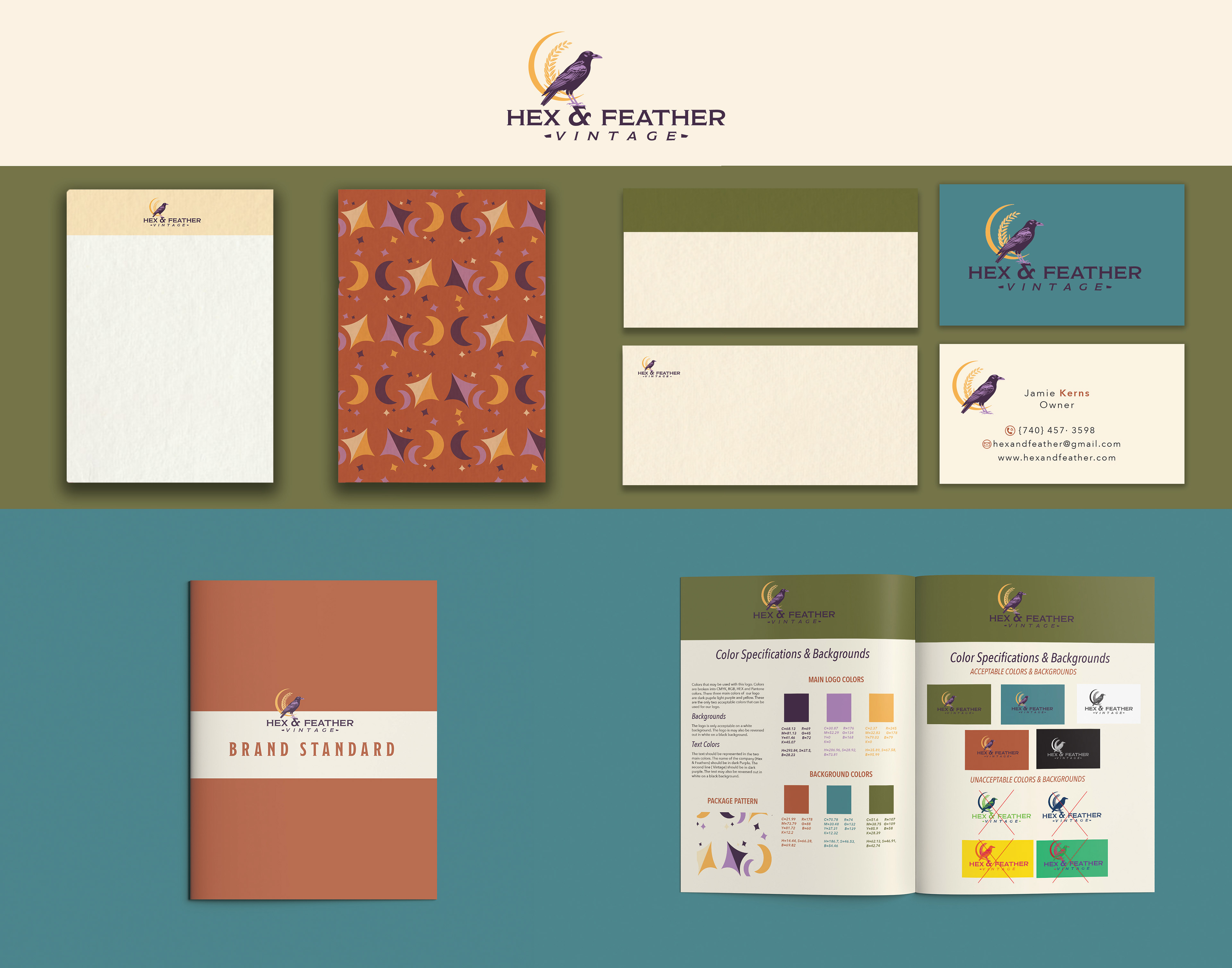
The brand identity was built to reflect both my mother’s and my personal tastes. The logo features a crow—her favorite animal—chosen for its symbolism of adaptability, a trait that perfectly represents her ability to work with what she has and create beauty from it. The crow is illustrated in purple, my favorite color, as a way of blending both of our personalities into the visual identity.
The brand identity was built to reflect both my mother’s and my personal tastes. The logo features a crow—her favorite animal—chosen for its symbolism of adaptability, a trait that perfectly represents her ability to work with what she has and create beauty from it. The crow is illustrated in purple, my favorite color, as a way of blending both of our personalities into the visual identity.
Target Audience & Visual Style:
Our demographic includes individuals drawn to the Pagan lifestyle, as well as young adults who appreciate vintage aesthetics and one-of-a-kind objects. The visual style leans into a cottagecore and vintage vibe, using a palette of deep, moody tones balanced with modern elegance—colors that feel timeless and appeal to a broad audience.
Our demographic includes individuals drawn to the Pagan lifestyle, as well as young adults who appreciate vintage aesthetics and one-of-a-kind objects. The visual style leans into a cottagecore and vintage vibe, using a palette of deep, moody tones balanced with modern elegance—colors that feel timeless and appeal to a broad audience.
Slogan & Message:
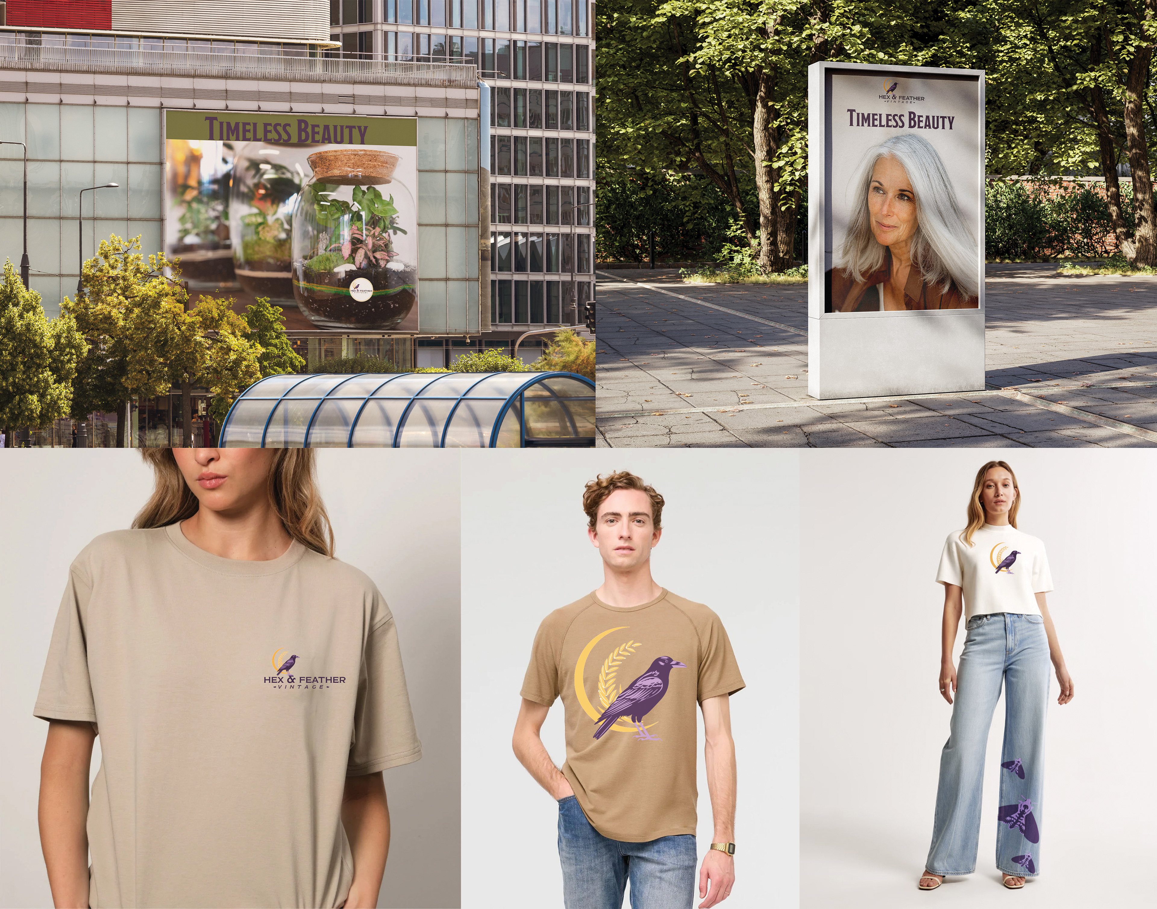
Our slogan, “Timeless Beauty,” encapsulates our philosophy: that old things still have value, charm, and a rightful place in the present. Through this brand, we aim to celebrate sustainability, creativity, and the quiet magic of giving forgotten objects new purpose.
Our slogan, “Timeless Beauty,” encapsulates our philosophy: that old things still have value, charm, and a rightful place in the present. Through this brand, we aim to celebrate sustainability, creativity, and the quiet magic of giving forgotten objects new purpose.
Result:
Hex and Feathers is more than a shop—it’s a shared vision, built on heritage, individuality, and a deep respect for the past. The brand identity tells this story through thoughtful design, meaningful symbolism, and a visual language that honors where things come from—and where they’re going.
Hex and Feathers is more than a shop—it’s a shared vision, built on heritage, individuality, and a deep respect for the past. The brand identity tells this story through thoughtful design, meaningful symbolism, and a visual language that honors where things come from—and where they’re going.