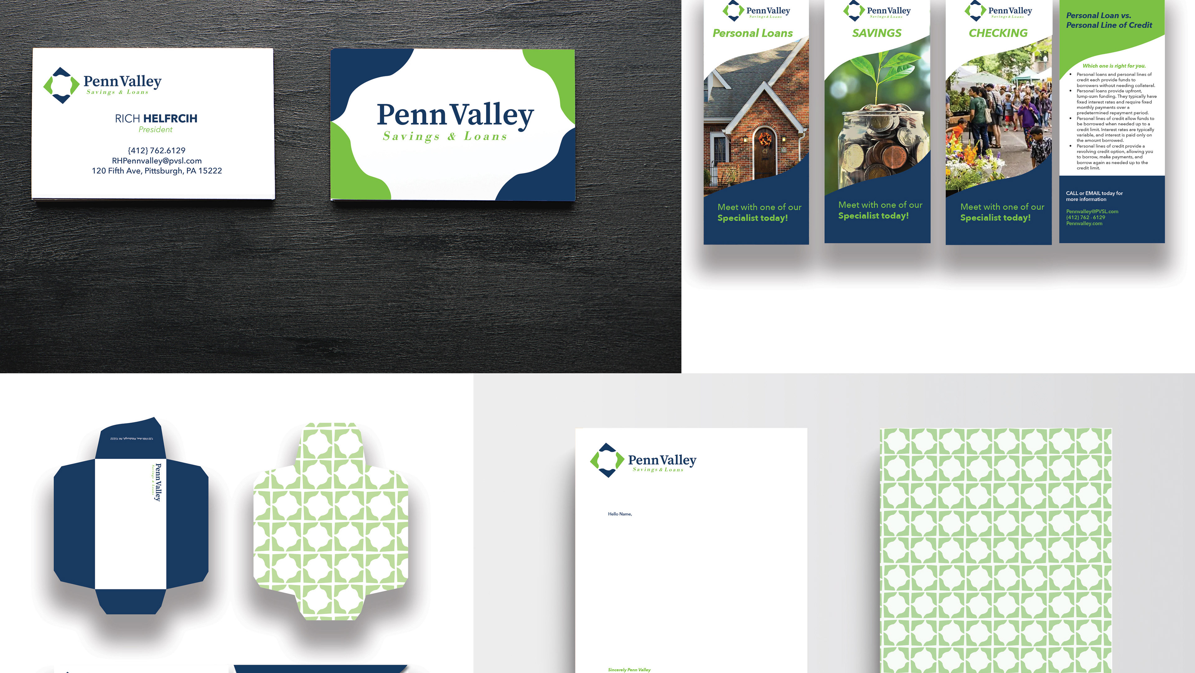
Building a Brand
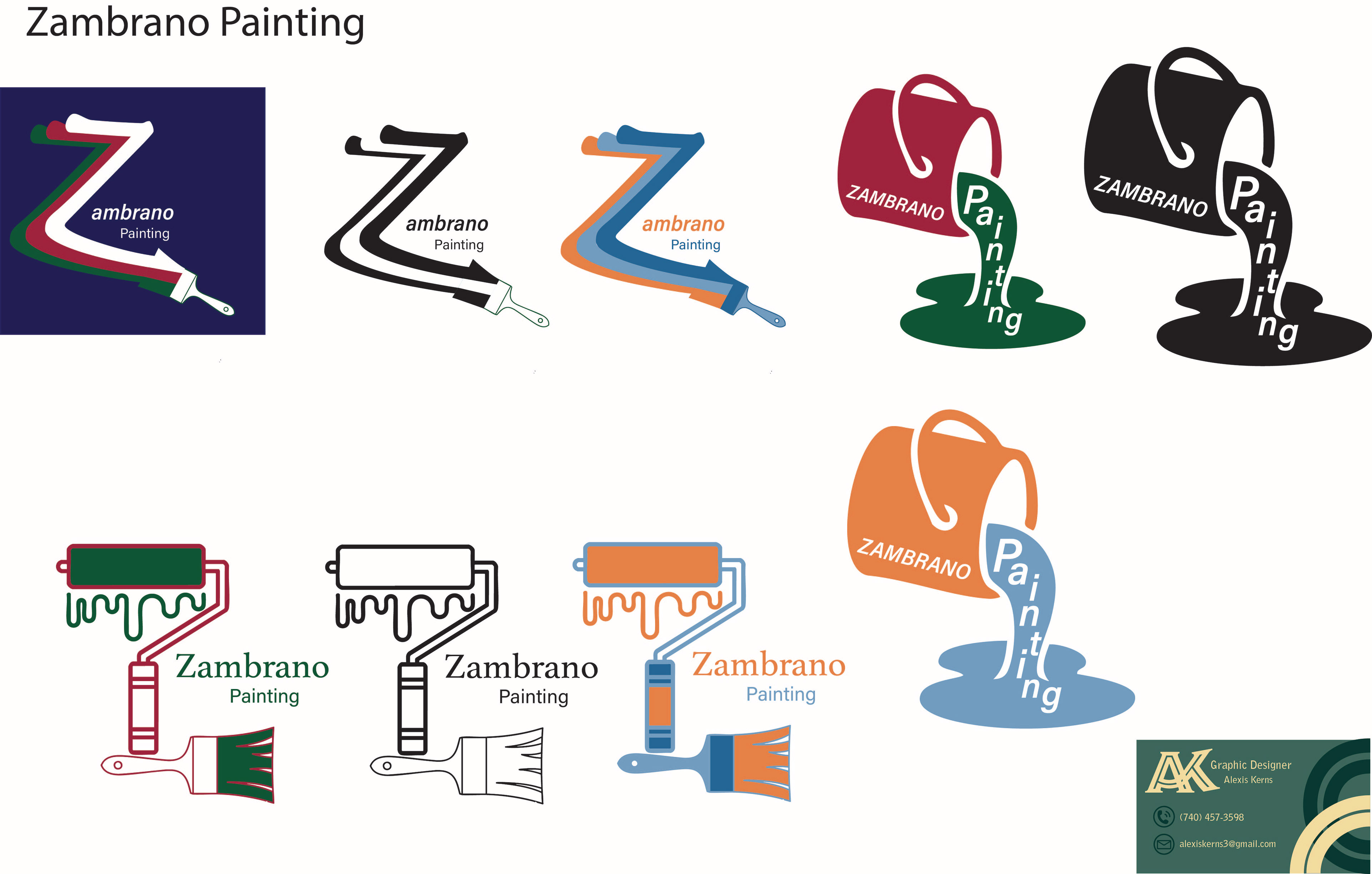
Rough Ideas:
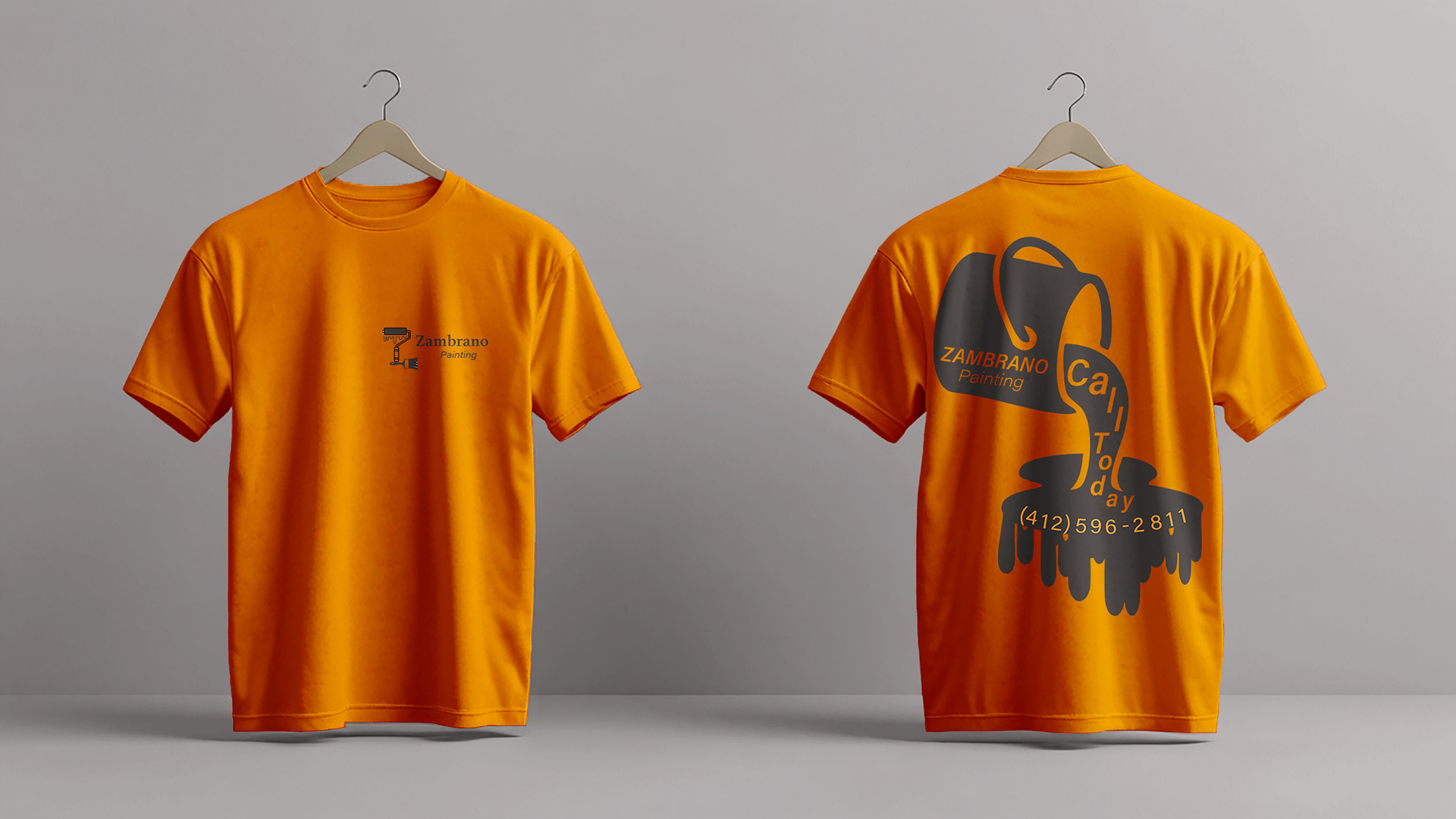
The job started just with a verbal meeting that went over what they might want out of a logo. The main key elements they wanted out of a logo was "drippy, red, white, green, and to use the Z in the name." While the direction seemed simple at first glance, these broad yet specific requests posed a creative challenge. The word "drippy" opened a wide range of stylistic interpretations—should it be playful, edgy, eerie, or graffiti-like? Each carried a different tone, and without a clear brand identity to anchor the design, it became a balancing act between imagination and restraint. The color palette—red, white, and green—immediately suggested an association with Italian themes, but the budget only allowed for a one-color job, which meant using all three colors wasn’t an option and required rethinking how to represent that idea with minimal elements. Most challenging was incorporating the "Z" in a meaningful way without changing the overall name or feel. It had to stand out yet not overpower the rest of the design. Every idea that emerged seemed to miss one piece of the puzzle, making the brainstorming phase feel like a loop of almost-right concepts.
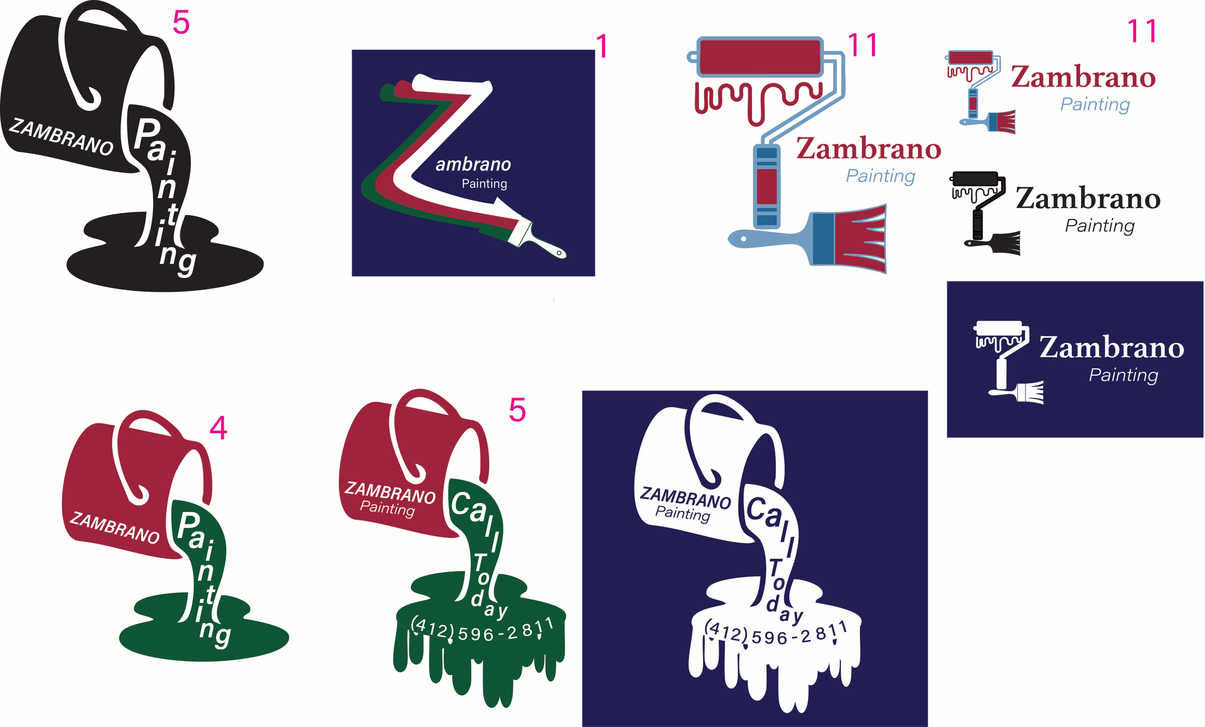
First Options Presented to the Client.
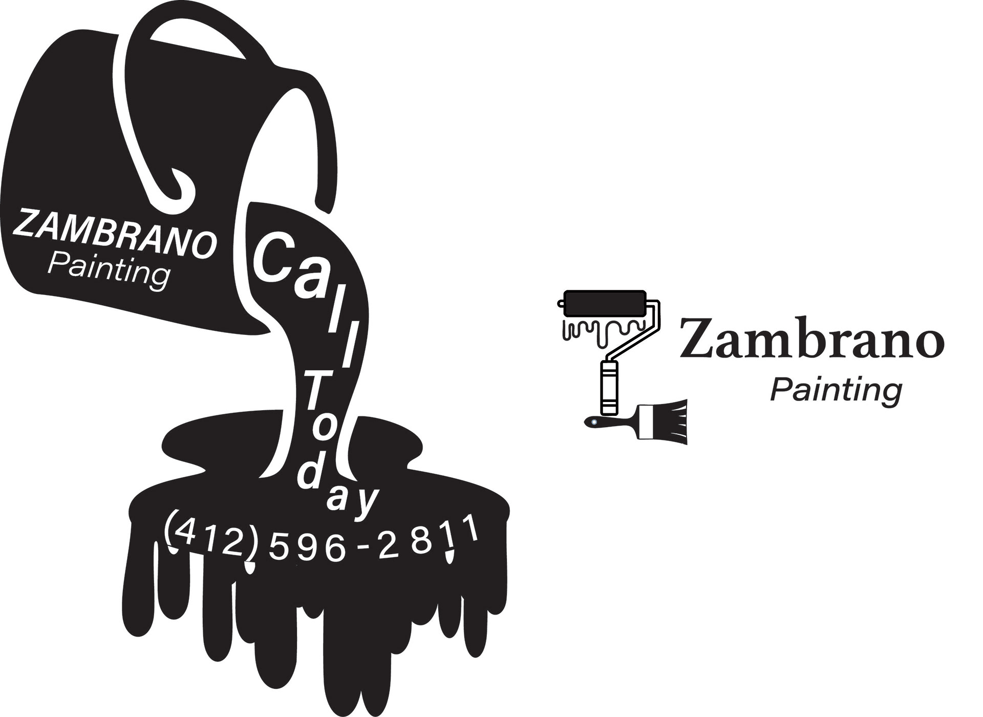
Second Options After Revision
Final Logo:
The client ultimately selected two logo designs from the presented options. Logo #11 was chosen as the official primary mark, while logo #5 was designated as a secondary logo specifically for apparel use. The logos were initially presented in color to help visualize the full design potential, with the understanding that for the t-shirts, they would be produced in black or white due to budget constraints. During this stage, the client also decided to move away from the original red, white, and green color scheme, opting instead for a navy background on the business cards, which marked a shift in their overall branding direction. With both logos finalized and color usage clarified, production proceeded smoothly, resulting in the successful creation of business cards and an initial run of 60 custom t-shirts.
Business Card Options
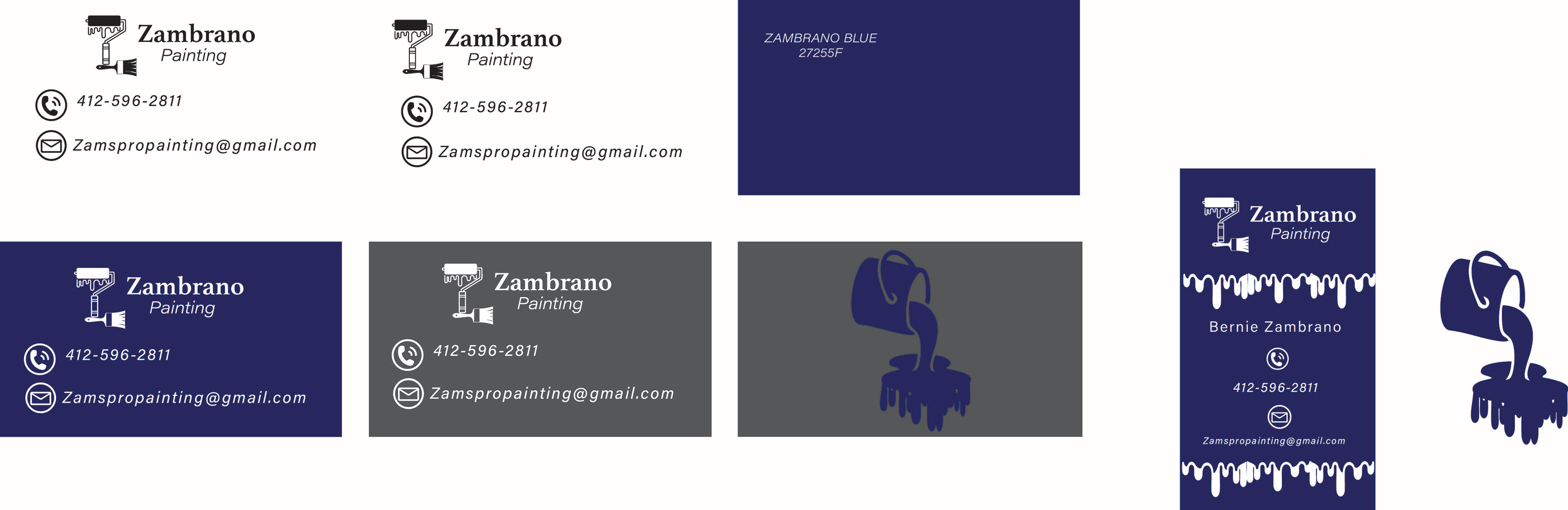
Final Cards

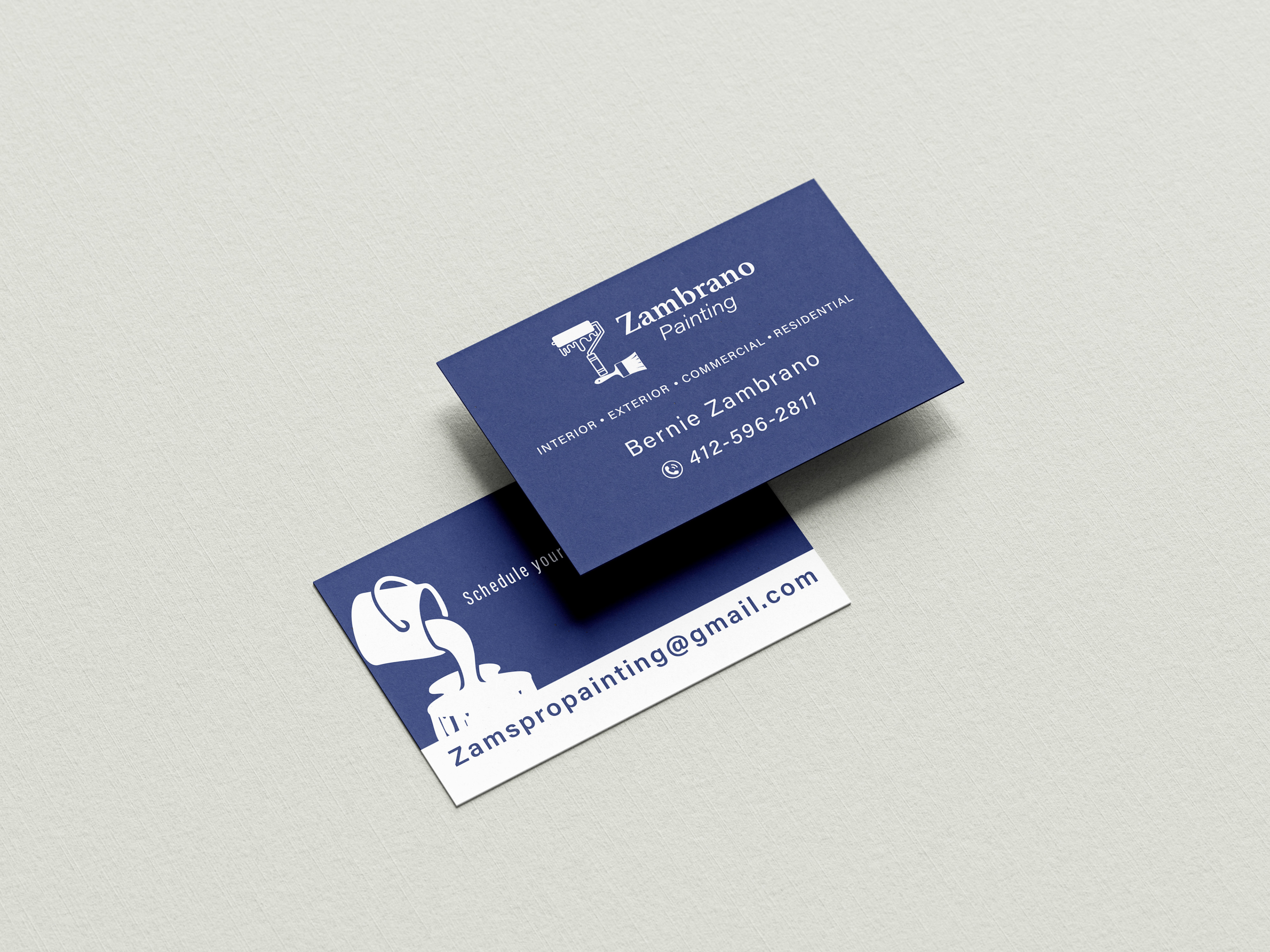
Business Cards:
The final color palette chosen by the client included navy blue, white, gray, and black—colors they felt offered a more professional and accurate representation of their business compared to the previously discussed red, white, and green scheme. Once the new color direction was established, the business card design evolved further. After reviewing the initial layout, the client requested the addition of their list of services, along with the promotional phrase “Schedule your FREE consultation today!” on the back of the card.
This presented a new design challenge: integrating a significant amount of content into a limited space without compromising legibility or visual hierarchy. Careful attention had to be given to typography—specifically font size, kerning (the space between individual characters), leading (the vertical spacing between lines of text), and overall layout balance. The goal was to ensure that the text remained clear and readable at standard business card size while still feeling visually cohesive with the branding. Achieving this required multiple layout iterations, subtle adjustments to tracking, and selective emphasis on key phrases to guide the viewer’s eye naturally. Despite the tight spatial constraints, the final result maintained both functionality and aesthetic integrity.