Packaging Design Project
Overview:
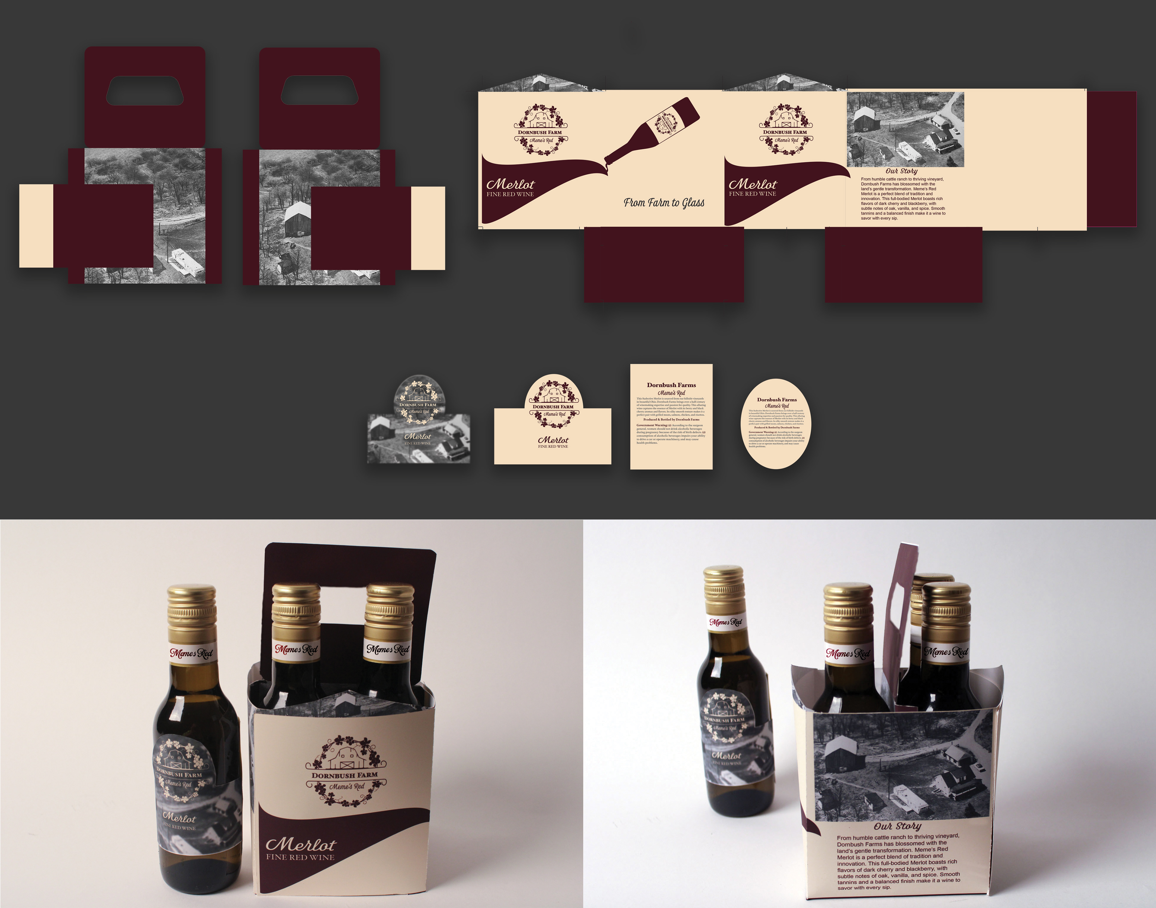
Dornbush Farms Wine is a packaging project rooted in personal history and storytelling. Inspired by my mother’s family farm, this design reimagines a former beef farm as a rustic, boutique vineyard—transforming legacy into lifestyle.
Dornbush Farms Wine is a packaging project rooted in personal history and storytelling. Inspired by my mother’s family farm, this design reimagines a former beef farm as a rustic, boutique vineyard—transforming legacy into lifestyle.
Concept & Inspiration:
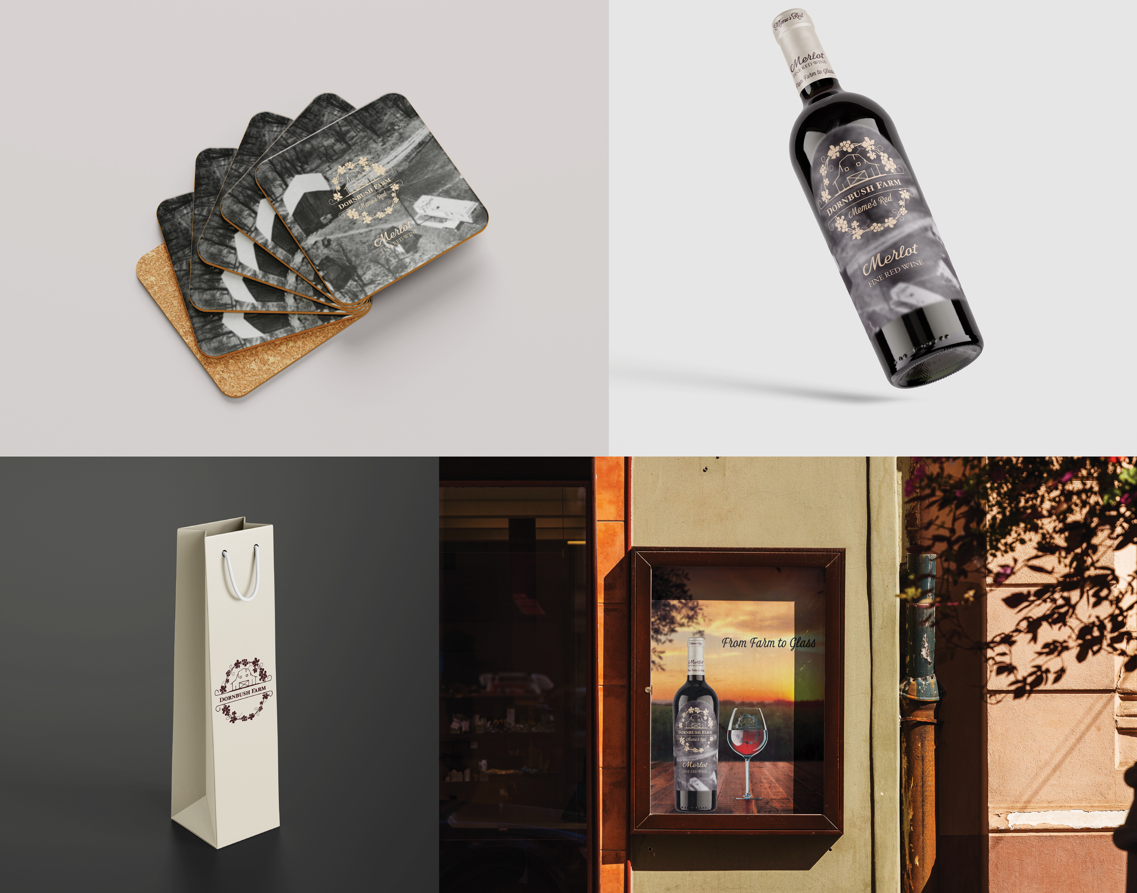
The foundation of this project lies in memory and reinvention. While the real Dornbush farm was once home to cattle, I envisioned it as a peaceful wine estate, where heritage and craft intertwine. The visuals used on the label are authentic photographs of the original family property, creating a tangible connection to place and past.
The foundation of this project lies in memory and reinvention. While the real Dornbush farm was once home to cattle, I envisioned it as a peaceful wine estate, where heritage and craft intertwine. The visuals used on the label are authentic photographs of the original family property, creating a tangible connection to place and past.
Design & Aesthetic:
One of the signature labels, Meme’s Red, is named in honor of my great-grandmother, affectionately called “Meme” by my mother. This personal detail adds emotional resonance to the branding. The color palette draws from the rich, velvety tones of a Merlot—deep reds, muted burgundies, and warm earth hues—evoking the complexity of the wine and the depth of the story behind it.
One of the signature labels, Meme’s Red, is named in honor of my great-grandmother, affectionately called “Meme” by my mother. This personal detail adds emotional resonance to the branding. The color palette draws from the rich, velvety tones of a Merlot—deep reds, muted burgundies, and warm earth hues—evoking the complexity of the wine and the depth of the story behind it.
Result:
The final packaging is a celebration of family, memory, and imagination—inviting consumers to experience not just a wine, but a story that’s been aged, crafted, and lovingly poured into every bottle.
The final packaging is a celebration of family, memory, and imagination—inviting consumers to experience not just a wine, but a story that’s been aged, crafted, and lovingly poured into every bottle.