Penn Valley Bank Logo Design
Brand Identity Concept
Overview:
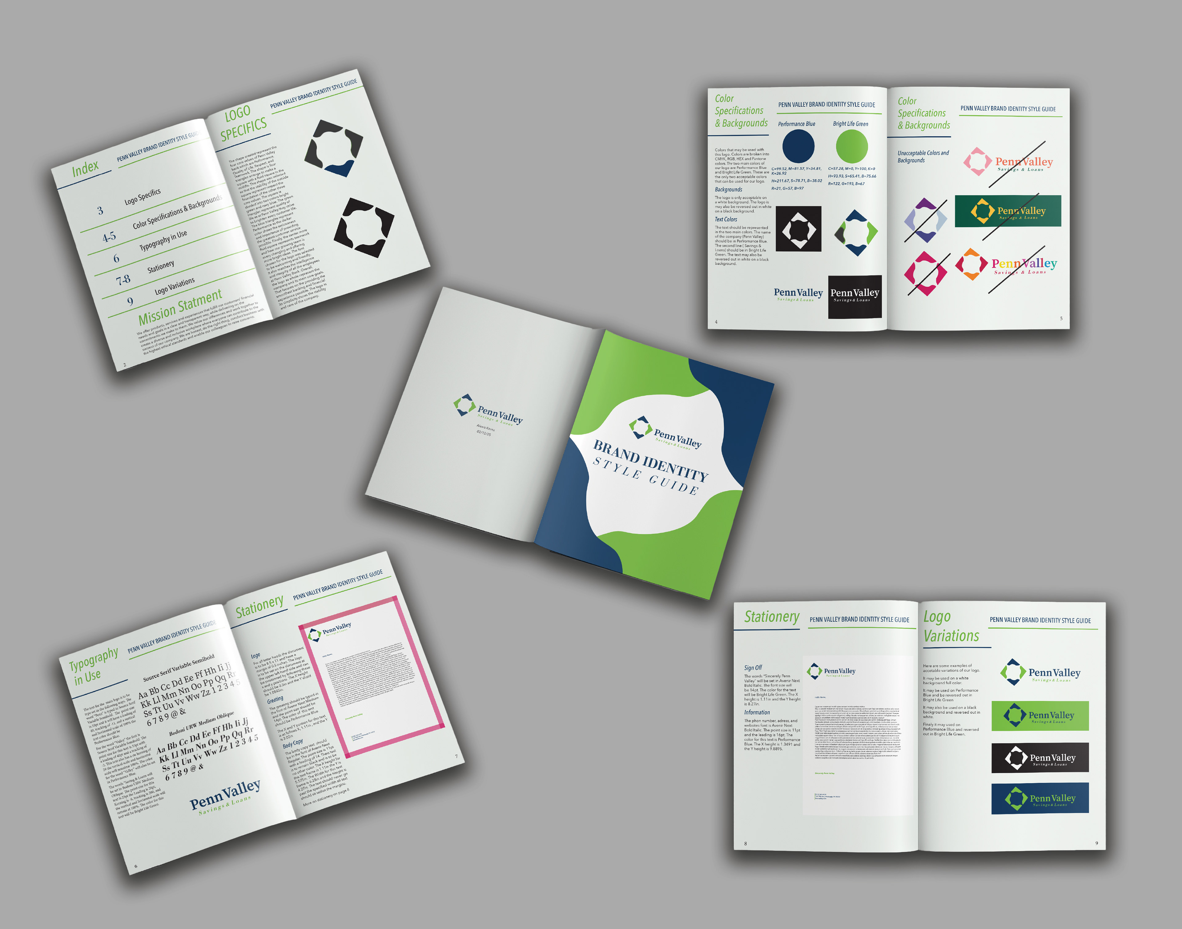
This logo was developed to visually represent the four core values of Penn Valley Bank: Performance, Quality of Life, Respect, and Teamwork. The design communicates trust, stability, and modernity—key qualities essential to a financial institution dedicated to both client service and internal culture.
This logo was developed to visually represent the four core values of Penn Valley Bank: Performance, Quality of Life, Respect, and Teamwork. The design communicates trust, stability, and modernity—key qualities essential to a financial institution dedicated to both client service and internal culture.
Concept & Symbolism:
The primary shape is composed of four triangles arranged to form a square, with a more fluid, organic square at the center. This arrangement is purposeful: the outer square provides a strong, balanced structure that symbolizes Respect—the foundational value supporting all others. Each triangle is divided by color to communicate different aspects of Penn Valley’s mission.
The primary shape is composed of four triangles arranged to form a square, with a more fluid, organic square at the center. This arrangement is purposeful: the outer square provides a strong, balanced structure that symbolizes Respect—the foundational value supporting all others. Each triangle is divided by color to communicate different aspects of Penn Valley’s mission.
Color Strategy:
Green Triangles represent Quality of Life—a vibrant hue chosen to reflect the bank’s goal of brightening every customer’s financial journey.
Blue Triangles represent Performance—the deep navy signaling professionalism, reliability, and the importance of delivering exceptional service.
Center Fluid Square represents Teamwork, capturing the dynamic, evolving nature of Penn Valley’s collaborative and innovative internal culture.
Typography:
The logo’s typography was selected to be warm, friendly, and approachable—while still aligning with the intelligence and integrity of Penn Valley Bank’s team. It complements the geometric mark with a clean, modern finish.
The logo’s typography was selected to be warm, friendly, and approachable—while still aligning with the intelligence and integrity of Penn Valley Bank’s team. It complements the geometric mark with a clean, modern finish.
Result:
The final logo is simple yet meaningful. It visually expresses Penn Valley Bank’s dedication to a stable and supportive banking experience, while reinforcing their core values through shape, and thoughtful design.
The final logo is simple yet meaningful. It visually expresses Penn Valley Bank’s dedication to a stable and supportive banking experience, while reinforcing their core values through shape, and thoughtful design.